One Page Responsive Website Template with Contact Form and Full-Screen Landing Page
Websites don’t have to be complicated. Sometimes all you need is a single page to describe what you do, showcase your products/services, and offer a contact form for your visitors to reach out.
In this tutorial, we are going to create a simple one page website with a contact form, that is responsive to different display sizes, and has a full-screen landing page for promoting your product or business. All that without bloating our website with unnecessary external libraries.
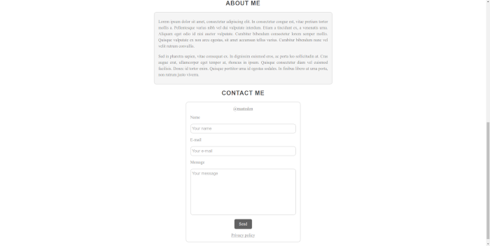
Preview
So here’s what we are going to do.
When the site loads, our visitors will be presented with a full-screen landing page, which can include a logo or a background image.
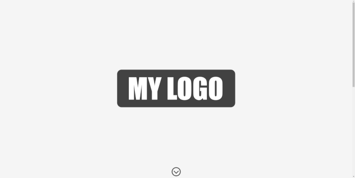
Clicking on the down-arrow, the page will smoothly scroll to the About section, which provides more information about our product/service. At the end of the page, we’ll have a contact form and social media links for our visitors to optionally get in touch.
Code
This is the directory structure we want to implement.
.
└─public
  ├─images
  │ └─logo.png
  ├─css
  │ └─style.css
  ├─js
  │ └─index.js
  └─index.html
Run the commands below in your shell.
mkdir -p public/{images,css,js}
touch public/index.html public/js/index.js public/css/style.css
Feel free to choose any image for logo.png. Alternatively, you can download the image used in this tutorial.
Open index.html in your favorite editor and add the contents below.
<!DOCTYPE html>
<html lang="en">
<head>
<meta charset="utf-8" />
<meta name="viewport" content="width=device-width, initial-scale=1" />
<title>My Page</title>
<link rel="stylesheet" href="css/style.css" />
</head>
<body>
<header class="fullscreen-landing">
<div class="logo">
<img src="images/logo.png" />
</div>
<a id="arrow-down" href="">
<span></span>
</a>
</header>
<article id="main" class="main">
<h2>About Me</h2>
<section class="section-box">
<p>
Lorem ipsum dolor sit amet, consectetur adipiscing elit. In
consectetur congue est, vitae pretium tortor mollis a. Pellentesque
varius nibh vel dui vulputate interdum. Etiam a tincidunt ex, a
venenatis urna. Aliquam eget odio id nisi auctor vulputate. Curabitur
bibendum consectetur lorem semper mollis. Quisque vulputate ex non
arcu egestas, sit amet accumsan tellus varius. Curabitur bibendum nunc
vel velit rutrum convallis.
</p>
<p>
Sed in pharetra sapien, vitae consequat ex. In dignissim euismod eros,
ac porta leo sollicitudin at. Cras augue erat, ullamcorper eget tempor
at, rhoncus in ipsum. Quisque consectetur diam vel euismod facilisis.
Donec id tortor enim. Quisque porttitor urna id egestas sodales. In
finibus libero at urna porta, non rutrum justo viverra.
</p>
</section>
<h2>Contact Me</h2>
<section class="contact">
<div>
<a href="https://mastodon.social/">@mastodon</a>
</div>
<form id="contact-form">
<div>
<label for="contact-name">Name</label>
<input
type="text"
id="contact-name"
name="contact-name"
placeholder="Your name"
required="required"
/>
</div>
<div>
<label for="contact-email">E-mail</label>
<input
type="email"
id="contact-email"
name="contact-email"
placeholder="Your e-mail"
required="required"
/>
</div>
<div>
<label for="contact-message">Message</label>
<textarea
id="contact-message"
name="contact-message"
placeholder="Your message"
style="resize: none"
rows="9"
required="required"
></textarea>
</div>
<div>
<button type="submit">Send</button>
</div>
</form>
<div>
<a href="privacy.html">Privacy policy</a>
</div>
</section>
</article>
<footer class="copyright">
<p>Copyright © 2023 My Page.</p>
</footer>
<script src="js/index.js"></script>
</body>
</html>
The href attribute of the down-arrow anchor <a id="arrow-down" href=""> can point to an element in our page to scroll to, but in that case when the user clicks on the arrow a #id will be appended to our page url. We don’t want that, so we leave the href empty to implement it in JavaScript.
Open our script, index.js.
(function () {
  "use strict";

  var CONTACT_ENDPOINT = "/api/contact";

  window.addEventListener("load", onLoad);

  function onLoad() {
    window.removeEventListener("load", onLoad);

    document
      .querySelector("#arrow-down")
      .addEventListener("click", function (event) {
        event.preventDefault();
        document.querySelector("#main").scrollIntoView();
      });

    var contactForm = document.querySelector("#contact-form");

    contactForm.addEventListener("submit", onSubmit);

    function onSubmit(event) {
      event.preventDefault();
      event.stopPropagation();

      var button = contactForm.querySelector('button[type="submit"]');
      button.blur();

      var name = contactForm.querySelector("#contact-name").value.trim();
      var email = contactForm.querySelector("#contact-email").value.trim();
      var message = contactForm.querySelector("#contact-message").value.trim();

      if (!name || !email || !message) {
        return;
      }

      button.disabled = true;

      request(
        CONTACT_ENDPOINT,
        {
          name: name,
          email: email,
          message: message,
        },
        function (status, response) {
          button.disabled = false;
          if (status !== 200) {
            console.error(status, response);
            return;
          }
          contactForm.reset();
        }
      );
    }
  }

  function request(url, params, callback) {
    var req = new XMLHttpRequest();

    req.open("POST", url);

    var headers = {
      "Content-type": "application/json",
    };

    for (var header in headers) {
      req.setRequestHeader(header, headers[header]);
    }

    req.onload = function () {
      callback(this.status, this.responseText);
    };

    req.onerror = function (e) {
      console.error(e);
      callback();
    };

    var body = JSON.stringify(params);

    req.send(body);
  }
})();
The script does two things. Firstly, it listens for a click event on the down-arrow (Line 13) and then smoothly scrolls the browser’s viewport to the About section. Secondly, it posts all contact form input field values to /api/contact when the Send button is clicked. Obviously, the handler for that endpoint has to be implemented server-side.
Finally, create style.css to make everything look nice.
body {
  width: 100%;
  min-width: 360px;
  height: 100%;
  margin: 0;
  text-align: center;
  color: #757575;
  background-color: #ffffff;
}

html {
  width: 100%;
  height: 100%;
  scroll-behavior: smooth;
}

h1,
h2,
h3,
h4,
h5,
h6 {
  text-transform: uppercase;
  font-family: sans-serif;
  font-weight: 700;
  letter-spacing: 1px;
  text-align: center;
  color: #424242;
  text-decoration: none;
}

a {
  color: inherit;
  outline: none;
  -webkit-tap-highlight-color: transparent;
  -webkit-touch-callout: none;
}

.fullscreen-landing {
  position: relative;
  display: block;
  -webkit-box-sizing: border-box;
  box-sizing: border-box;
  margin: 0 auto;
  padding: 1em 0;
  height: auto;
  min-height: 100%;
  width: 100%;
  overflow: hidden;
  text-align: center;
  background: #f5f5f5;
}

.fullscreen-landing .logo {
  position: absolute;
  top: 50%;
  left: 50%;
  width: 90%;
  -webkit-transform: translateX(-50%) translateY(-50%);
  -ms-transform: translateX(-50%) translateY(-50%);
  transform: translateX(-50%) translateY(-50%);
}

.fullscreen-landing .logo img {
  max-width: 100%;
  height: auto;
}

#arrow-down {
  display: inline-block;
  position: absolute;
  left: 50%;
  bottom: 10px;
  -webkit-transform: translateX(-50%);
  -ms-transform: translateX(-50%);
  transform: translateX(-50%);
  -webkit-user-select: none;
  -moz-user-select: none;
  -ms-user-select: none;
  user-select: none;
}

#arrow-down:focus {
  outline: none;
}

#arrow-down span {
  display: inline-block;
  -webkit-box-sizing: border-box;
  box-sizing: border-box;
  width: 48px;
  height: 48px;
  border: 4px solid #424242;
  border-radius: 50%;
  -webkit-box-shadow: 0px 0px 1px 1px rgba(0, 0, 0, 0.3);
  box-shadow: 0px 0px 1px 1px rgba(0, 0, 0, 0.3);
}

#arrow-down span:after {
  content: "";
  display: inline-block;
  -webkit-box-sizing: border-box;
  box-sizing: border-box;
  width: 50%;
  height: 50%;
  border-top: 4px solid #424242;
  border-right: 4px solid #424242;
  -webkit-transform: translateY(35%) rotate(135deg);
  -ms-transform: translateY(35%) rotate(135deg);
  transform: translateY(35%) rotate(135deg);
}

@media (hover: hover) {
  #arrow-down span:hover {
    border-color: #616161;
  }

  #arrow-down span:hover:after {
    border-top-color: #616161;
    border-right-color: #616161;
  }
}

#arrow-down span:active {
  border-color: #616161;
  box-shadow: none;
}

#arrow-down span:active:after {
  border-top-color: #616161;
  border-right-color: #616161;
}

.main {
  margin: 0 auto;
  padding: 0 1em;
  max-width: 700px;
}

.main p {
  line-height: 1.5;
}

.section-box {
  margin: 0 auto;
  padding: 0.5em 1em;
  background: #f5f5f5;
  border: 2px solid #e0e0e0;
  border-radius: 10px;
  text-align: justify;
}

.contact {
  margin: 0 auto;
  width: 100%;
  max-width: 450px;
  padding: 1em;
  border: 2px solid #e0e0e0;
  border-radius: 10px;
  background-color: #ffffff;
  -webkit-box-sizing: border-box;
  box-sizing: border-box;
}

.contact div {
  margin: 1em auto;
  text-align: center;
}

.contact > div:first-child {
  margin-top: 0;
}

.contact > div:last-child {
  margin-bottom: 0;
}

form {
  margin: 1em auto;
}

form label {
  display: block;
  text-align: left;
  margin: 1em auto;
  font: inherit;
  font-size: 1em;
}

form input,
form textarea {
  -webkit-box-sizing: border-box;
  box-sizing: border-box;
  font: 1em sans-serif;
  padding: 0.5em 0.3em;
  width: 100%;
  background-color: #ffffff;
  border: 2px solid #e0e0e0;
  border-radius: 10px;
  -webkit-transition: border-color ease-in-out 0.2s;
  -o-transition: border-color ease-in-out 0.2s;
  transition: border-color ease-in-out 0.2s;
  color: inherit;
}

form input::placeholder,
form textarea::placeholder {
  color: rgba(0, 0, 0, 0.4);
}

form input:focus,
form textarea:focus {
  border-color: #616161;
  outline: none;
}

form textarea {
  vertical-align: top;
  min-height: 5em;
  resize: vertical;
}

form button {
  font: inherit;
  font-size: 1em;
  display: inline-block;
  padding: 0.5em 1em;
  background-image: none;
  background-color: #616161;
  color: #f5f5f5;
  border: 2px solid #616161;
  border-radius: 5px;
  -webkit-box-shadow: 0px 0px 1px 1px rgba(0, 0, 0, 0.3);
  box-shadow: 0px 0px 1px 1px rgba(0, 0, 0, 0.3);
  -webkit-user-select: none;
  -moz-user-select: none;
  -ms-user-select: none;
  user-select: none;
  -webkit-tap-highlight-color: transparent;
  -webkit-touch-callout: none;
}

@media (hover: hover) {
  form button:hover {
    color: #f5f5f5;
    background-color: #757575;
    border-color: #757575;
    text-decoration: none;
    outline: none;
    cursor: pointer;
  }
}

form button:active,
form button:disabled {
  color: #616161;
  background-color: #f5f5f5;
  -webkit-box-shadow: none;
  box-shadow: none;
  text-decoration: none;
  outline: none;
  cursor: pointer;
}

.copyright {
  margin-top: 2em;
  font-size: 0.8em;
}
Since on touchscreen devices hover effects tend to get stuck on elements, we use media queries @media (hover: hover) to make sure hover effects are disabled on those devices.
Deploying
Our contact form requires server-side code to handle messages send by our visitors. In a previous post, I wrote a tutorial about deploying static websites with contact forms to Cloudflare, which you might find interesting to read. I also include instructions on how to add a CAPTCHA challenge to protect your contact form from bots. All for free!
You can find the source code in this tutorial in my GitHub repository.